Ag Census Mapping Tool Makes Data Visual
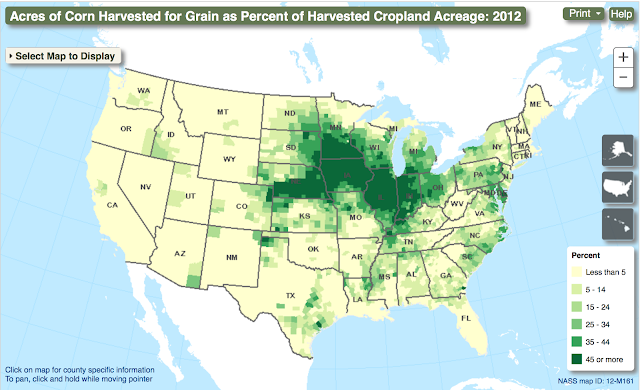
Every five years the United States Department of Agriculture takes a census. USDA NASS collects all kinds of data about farm production in the U.S.A. The agency has developed a tool to map this data. It is a way to visualize agricultural production, income, wealth distribution, management type, and the demographics of farmers. These three maps show the primary growing regions for corn, soybean, and wheat. The darkest green areas represent acres where the cropland is at least 45 percent sown to the crop listed. The corn belt is easy to see, and not that much of a surprise. However, the primary soybean growing regions of the nation are bit more diverse than you might expect and seem to follow the Mississippi Valley watershed from New Orleans to St. Louis, along the Ohio River Valley and the mighty Missouri River.


