Illinois Issues: IL Report Card Now Has Even More Data

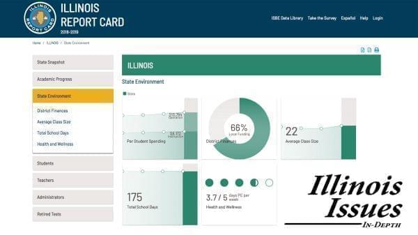
The Illinois School Report Card offers a wealth of detailed data. Illinois State Board of Education
The Illinois State Board of Education released its new report card on Wednesday. That name makes it sound like gives schools a grade, which it does. But there’s much more to it than that. Here are five things you need to know about the Illinois Report Card:
1. You won't get grounded.
The Report Card isn't actually a card; it’s a website that provides a plethora of quantitative data on every public school district and campus in Illinois. But one of those data points is basically a grade, or (to use ISBE lingo) a “summative designation.” Each school is designated Exemplary, Commendable, Underperforming or Lowest-Performing. The label is determined by a mix of factors (for example test scores, graduation rates, absenteeism) that result in a score. Schools that score in the top 10 percent are labled Exemplary, unless they have one or more “underperforming student groups.” Schools that don’t make the top 10 percent but have a graduation rate greater than 67 percent get called Commendable, unless they have one of those “underperforming student groups.” Any schools with a student group (such as racial or ethnic minorities, English learners, economically disadvantaged students or children with disabilities) performing below the lowest 5 percent of students in the state is labled “Underperforming.” Schools labeled “Lowest Performing” represent the lowest 5 percent, and, if they’re high schools, their graduation rate's under 67 percent.
Most schools land in the Commendable category. And for the schools in the last two categories, there is some good news: Those labels make the schools eligible for more extra support through the state.
These labels are pasted on every school’s report card, because they're required by federal law, which also demands identification of the “underperforming group(s)” implicated in the label.
If you want more info about the formulas behind these labels, ISBE has a dense, 75-slide PowerPoint that one or more of your school officials probably sat through.
2. You really can "follow the money."
The Report Card has long shown each school district’s financial resources, but this year, for the first time, the it reveals how that money is allocated among the schools in each district. For example, in Springfield, per-pupil spending ranges from about $8,000 at the Early Learning Center up to $22,880 at Douglas PREP. Those numbers likely reflect the variances in teacher pay (elementary teachers tend to have lower salaries than high school teachers) and the lower number of students at Douglas.
Coming up with these calculations wasn’t easy. ISBE collaborated with districts to decide what to count where, and how to parse out district-wide expenses. ISBE officials have said they hope sharing site expenditures will “spark conversations” about different needs. It’s another federal requirement.
3. It has data districts don't publicize.
How many students spent their days in in-house suspension? How many got expelled from school? How many brought a gun? The answers to these questions can be found on the Report Card. As of this year, it includes a big batch of numbers from U.S. Department of Education’s Civil Rights Data Collection. They aren’t quite as fresh as the rest of the Report Card numbers; the CRDC numbers on Illinois’ 2019 Report Card were collected in the 2015-16 school year. And some categories (such as Advanced Placement, International Baccalaureate, and dual credit courses) overlap data that ISBE already collects and presents separately on the site. However, CRDC also collects district-level discipline data, from in-house suspensions through school-related arrests, violent incidents, firearms on campus, and homicides.
4. Data needs context.
Whether you’re curious about class sizes, pension costs, administrative ratios, or teacher retention rates, those numbers mean more when you’ve got a way to compare them over space and time. One of the best features of the Report Card is that it just takes one click to compare almost any data point to peer districts, or statewide averages, or the past five years.
5. Sometimes it’s easier to get your school data the old-school way.
If you’re the kind of person prefers plain print-outs to pie charts, the Report Card is available in a more static format. On the landing page of each district and each school, you’ll see the words “ISBE Classic PDF Report Card” in a small blue font. Click there to find pages you can print out and highlight. Each school’s PDF version is around 50 pages.
While this version is less-interactive, it’s more reliable. It has been known to function even when the jazzier site is down, as it was Wednesday night.
If you really want to dig into the data, you can download the entire set as one enormous Excel file. If you’re the type who prefers to convert Excel to Google Sheets, you’ll have to do it by hand, as this file’s too big to import.
Links
- Illinois Issues: Abortion Restrictions In Surrounding States Draw Women To Illinois
- Illinois Issues: Voters Support More Statewide Gun Regulation, Survey Shows
- Illinois Issues: Survey—Voters Diverge On Gov, Economy
- Illinois Issues: Sacred Buildings In An Age of Decline
- Illinois Issues: Alaina Hampton On Life After Speaking Out
- Illinois Issues: Charlie Wheeler On The Past And Future Of Statehouse News

